Updates

Below you will find a list of updates made to the mimeeq application. We offer a transparent view of each update detailing; New Features, Improvements and important Fixes. Mimeeq is a self-funded business with a passionate team, we value our customers and value your feedback.

  1. What's New in Mimeeq: Improvements for Filter and Thumbnail Widgets πŸŽ‰

    New Feature

    We've just made filtering and searching for materials way easier!

    We've improved our Filter and Thumbnail Widgets with powerful new features including a handy search box, collapsible filter sections, and a powerful global/local settings system. These improvements create a more intuitive navigation experience that helps customers find exactly what they're looking for. Scroll down to discover the details πŸ‘‡

    Β 

    πŸ”Ž Advanced Search

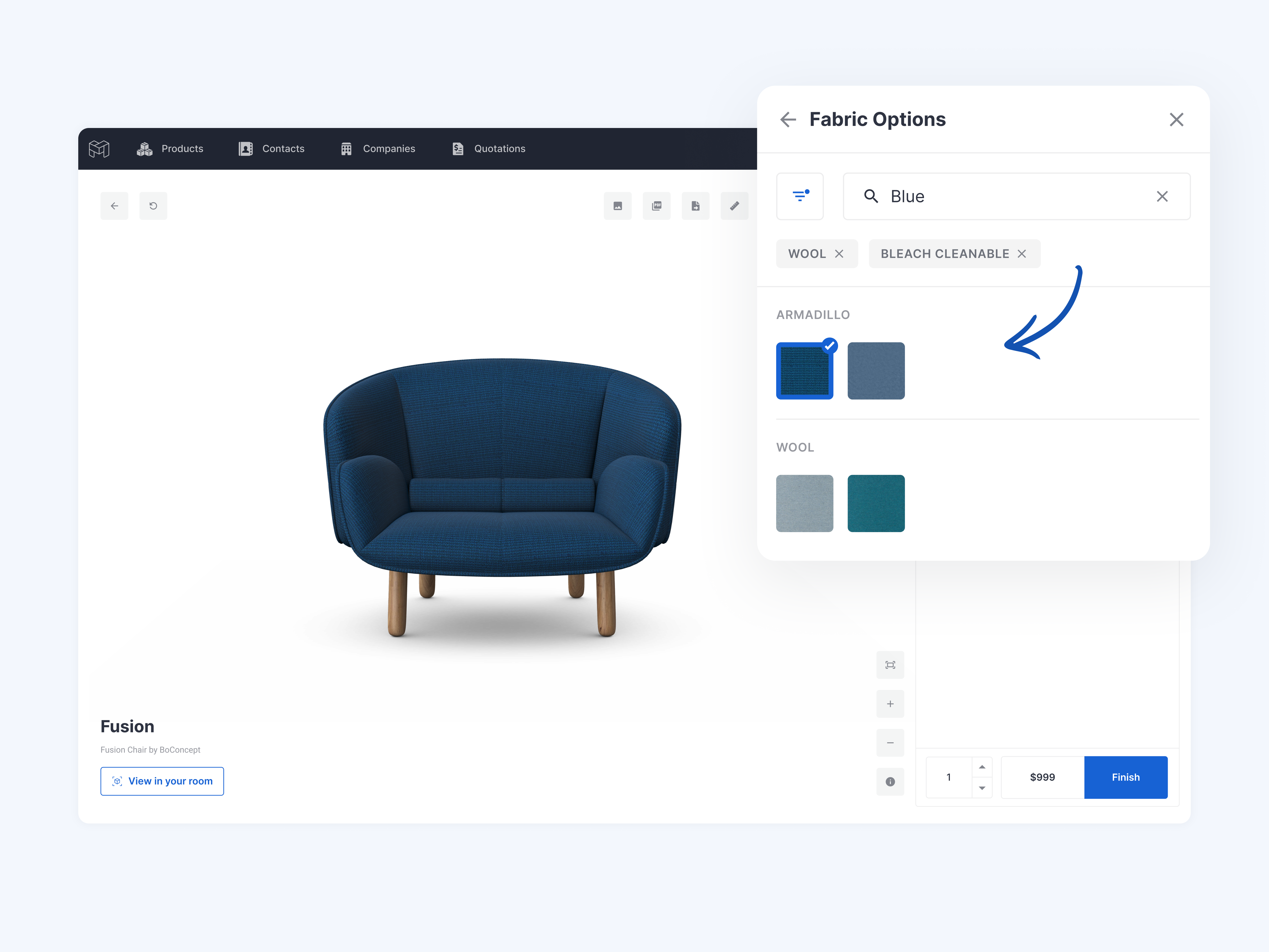
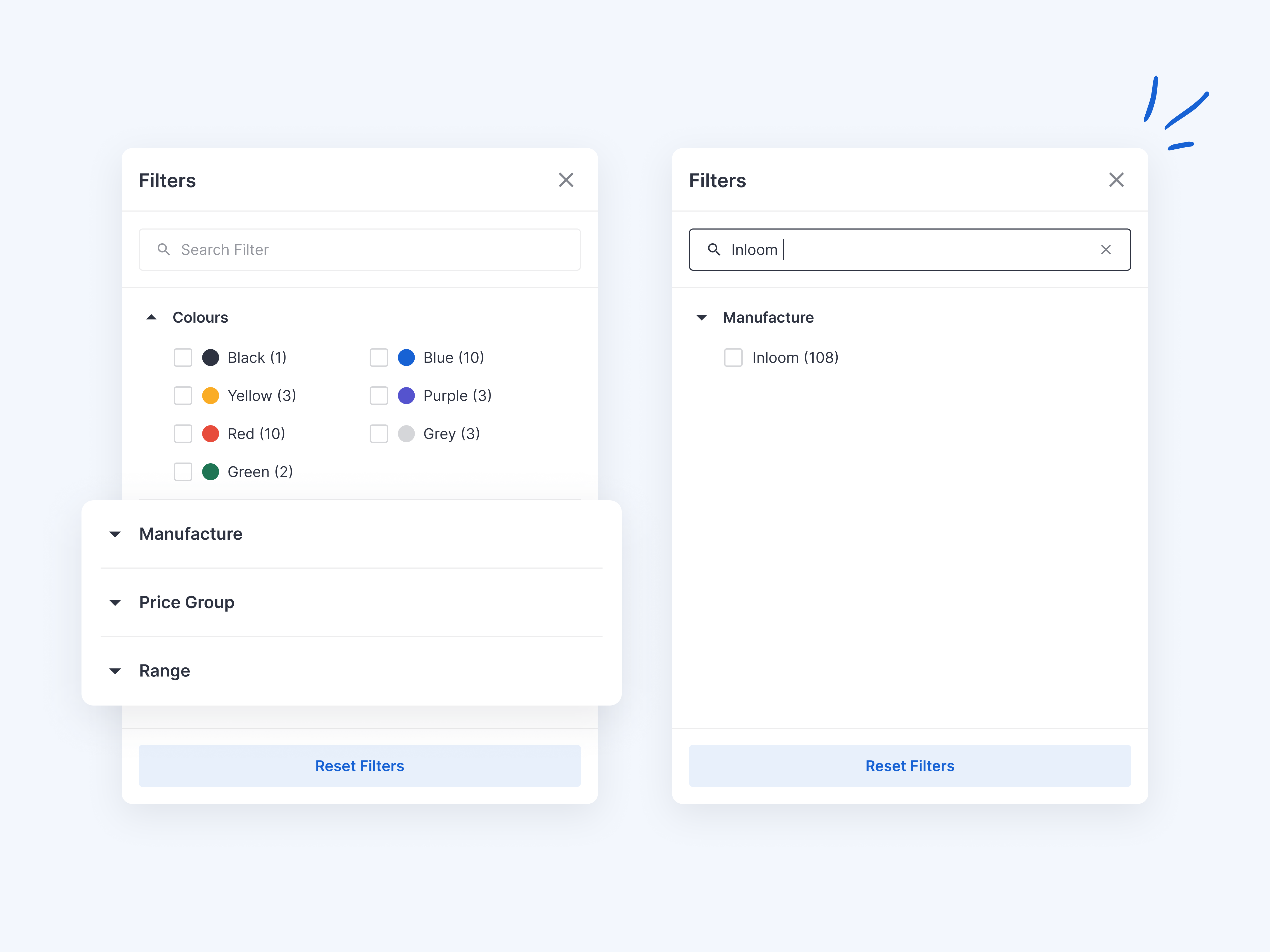
    Finding that perfect material just got easier! We've added a smart search box at the top of your Filter Widget that lets customers instantly find what they're looking for β€” whether they know the exact code, the name of the material or option set, or even the filter name.

    2

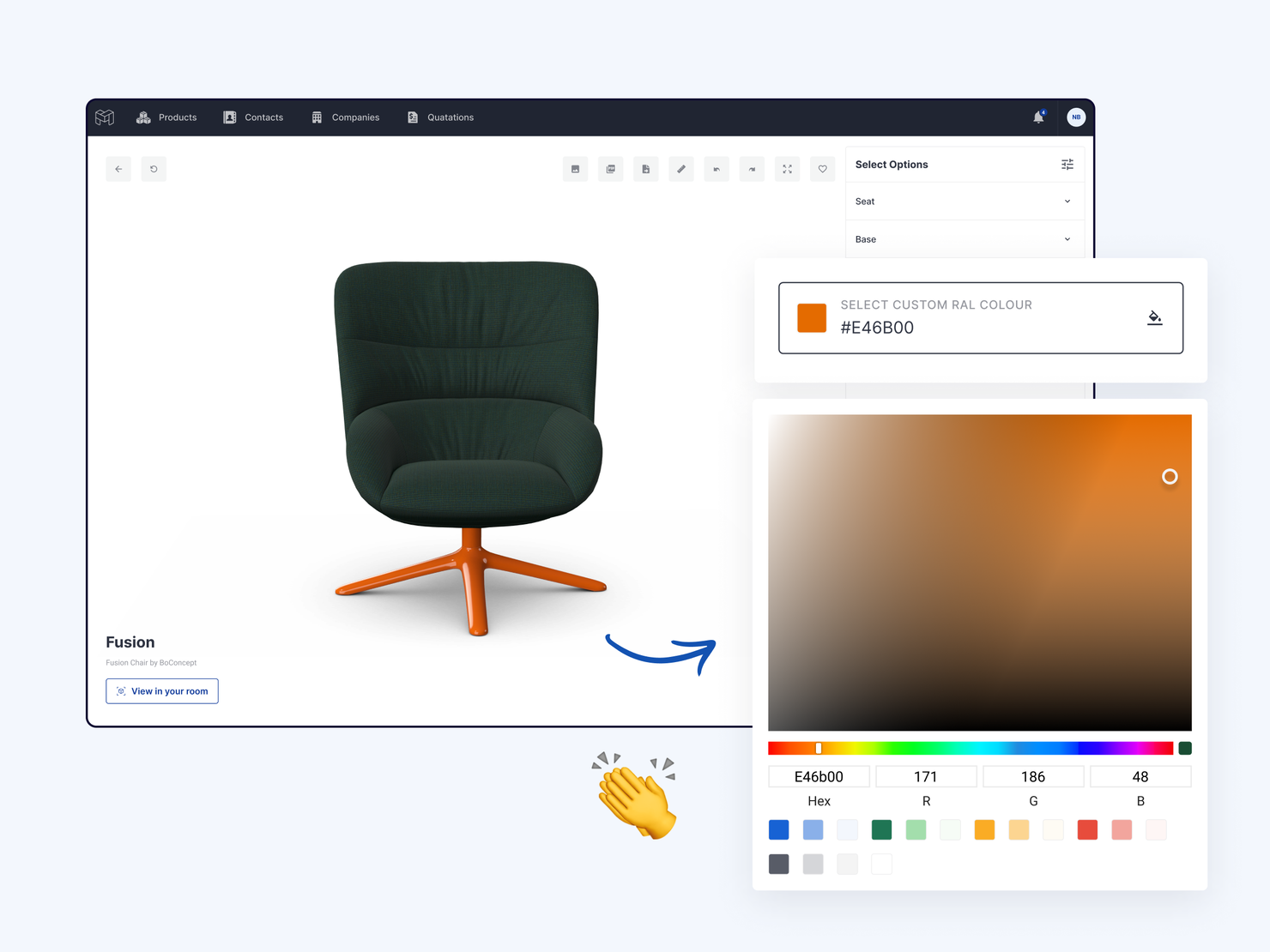
    Search Options within Option Blocks for Filter and Thumbnails Widget Types

    When there is allot of options for example 100 and the customer already knows they want to select for example a fabric that they know the name or code of, it would be good if there was an optional search box that can be added to the top above the list of options to allow the customer to quickly filter the list of options. Additionally if the option had filters applied to it searching for example red would filter to those options

    Marcin G
    Completed / Shipped / Live βœ…

    0

    search example

    Β 

    πŸ”— For step-by-step guides on how to set up, configure, and effectively use widgets, visit our detailed help articles: Thumbnail Widget Configuration and Filter Widget Configuration.
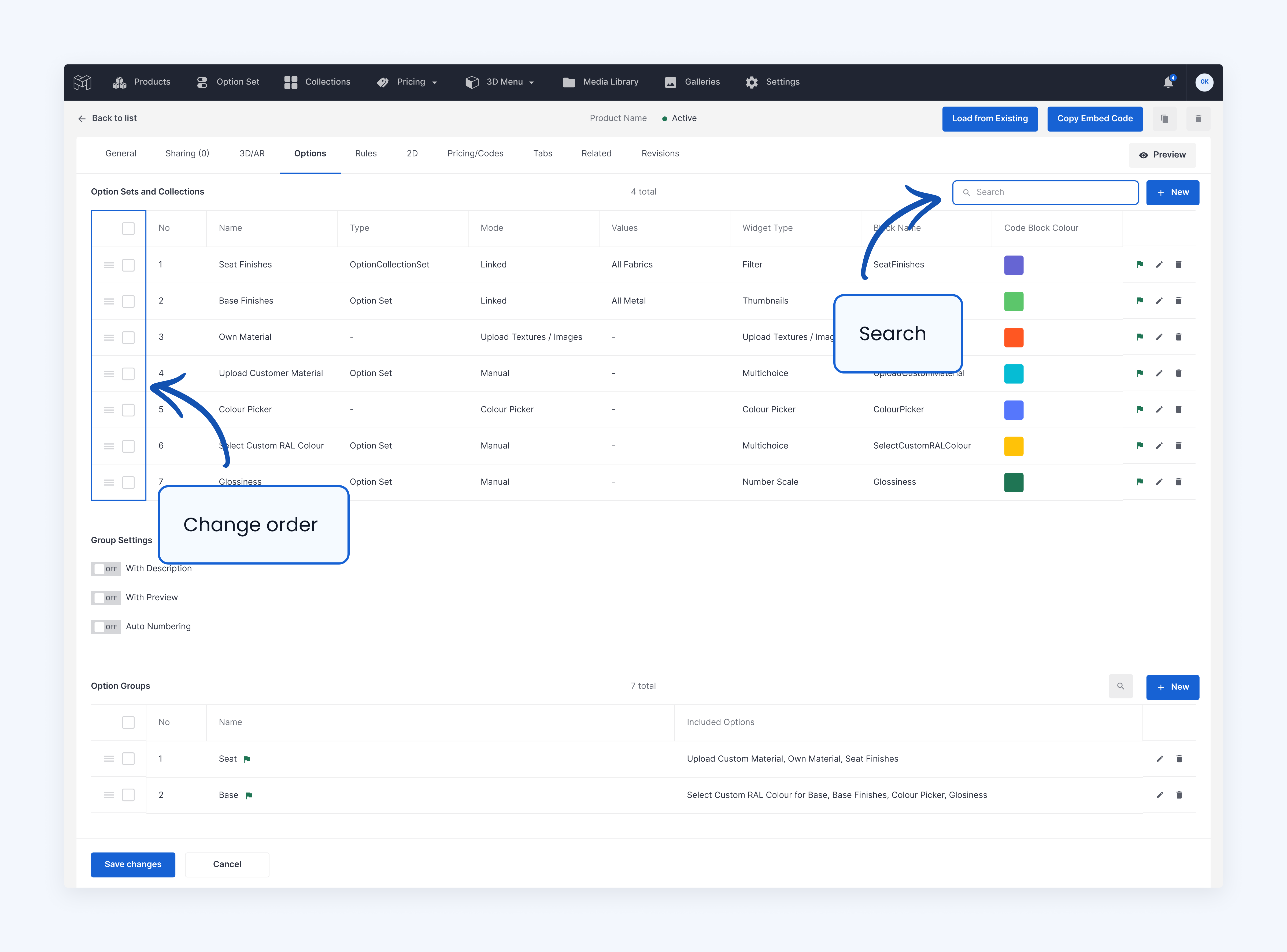
    Β 

    πŸ› οΈ Improved Filter Organization

    We've optimized the filter modal experience with:

    • Collapsible filter sections for better organization
    • Search functionality within the filter modal
    • Combined search and filter capabilities for better results

    You can choose which features to use based on your products. For simple products with few options, you can keep it basic. For complex products with many choices, you can turn all new features on. This flexibility lets you create the best experience for each product type.

    2

    Search and collapse in filter widget

    It would be great if we can search through the filters. Additionally, since you can have quite an extended filter widget, it would be great if you can collapse filter parents to prevent long scrolling

    Stephanie S
    Completed / Shipped / Live βœ…

    0

    filter modal

    Β 

    βš™οΈ Global Template Settings for Widgets

    Setting up widgets used to mean configuring the same options over and over for each product. Not anymore! Our new template system lets you:

    • Create once, use everywhere: Define your perfect widget configuration as a global template
    • Apply in seconds: Select "Global template" as the widget source when setting up a new product or updating an existing one
    • Stay flexible: Need something different for a specific product? Just switch to "Local settings" and customize away

    This solves the headache of repetitive setup work when managing multiple products. For example, if you always want thumbnails with a search bar and specific styling across your fabric catalog, set it once as a global template instead of recreating it dozens of times.
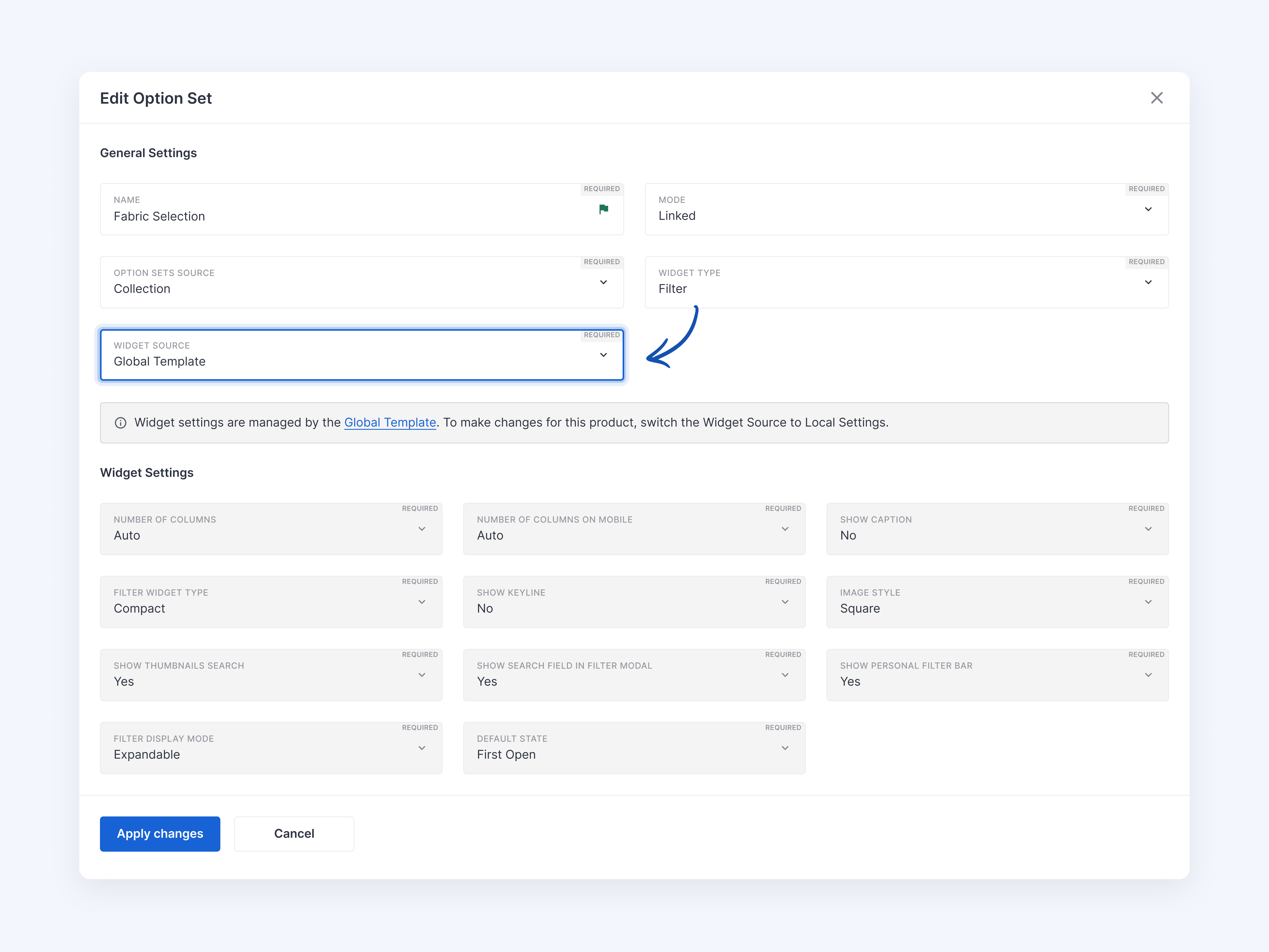
    settings example

    Β 

    πŸ”— For a step-by-step guide on how to configure and use Global Template vs Local Settings visit our Detailed Help Article.
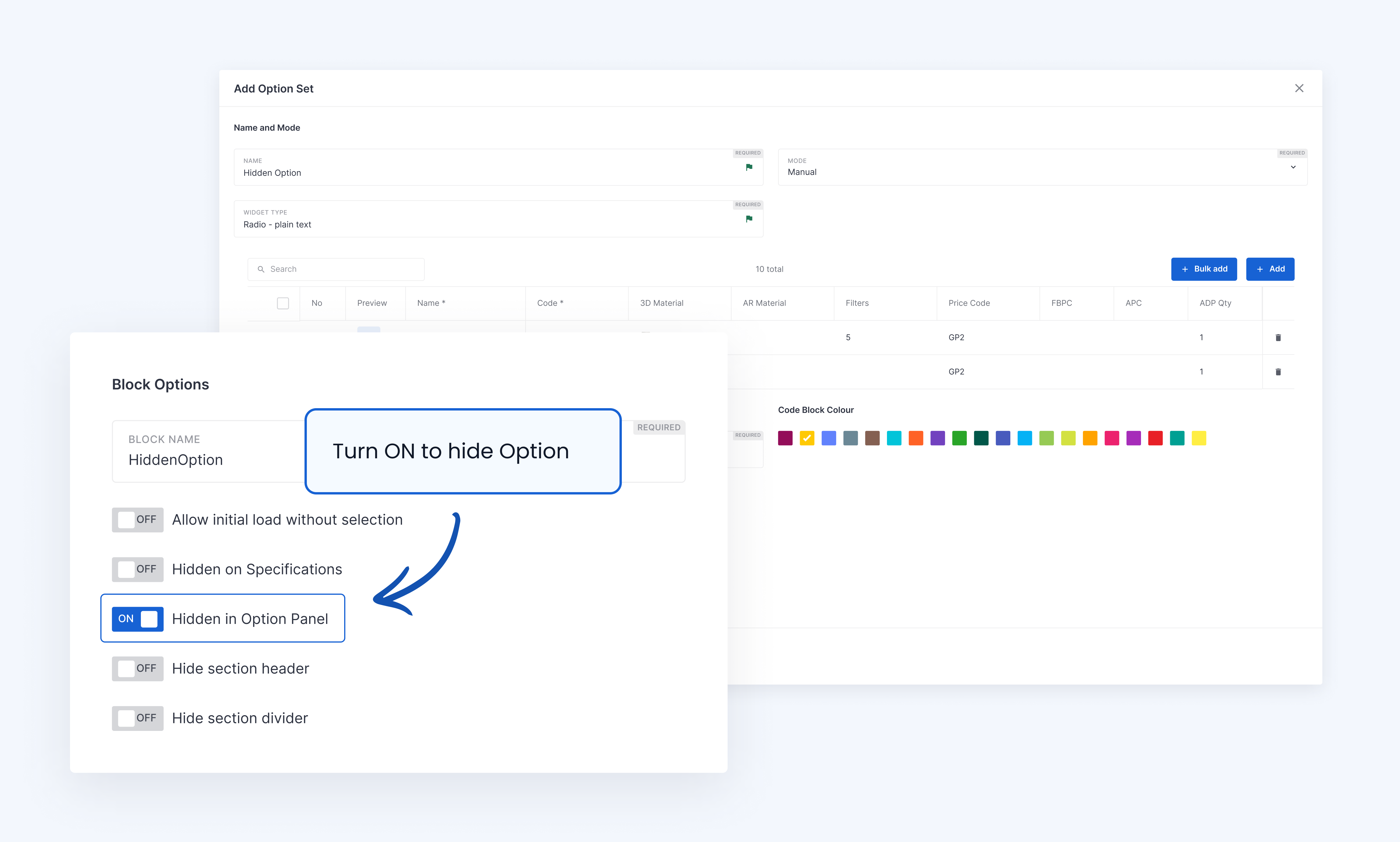
    Β 

    πŸ“Œ Important Note About Existing Products

    These features are live today for all customers. All your existing products will maintain their local settings, but with some default changes:

    • Search functionality in the Filter Widget is automatically turned ON
    • Collapsible filter sections are set to OFF by default
    • Filter search within the modal is automatically turned ON
    • Personal Filter Bar is automatically turned OFF

    If you want to change these settings, you can adjust them at either the individual product level or through global settings.

    Β 

    πŸ“Œ These new features are not automatically available in custom UI environments. Contact our support team to have these features added to your custom implementation.

  2. What's New in Jan 2024

    New Feature
    Improvement

    Β 

    πŸ†• Colour Picker

    You can now add a colour picker that dynamically changes materials on the configurator Interface. Here is our detailed help article πŸ”—.

    1

    Colour Picker Option Widget

    We are going to be adding a new widget type called Colour Picker. The Colour Picker will allow you to expose it as a material input for your customer. So, if you want to offer any RAL metal colour, for example, you can do that by exposing the widget. πŸš€ Due to Launch End January 2024

    Neal Bailey
    Completed / Shipped / Live βœ…

    1

    image

    Β 

    πŸ‘‰ Allow customers to change the footer about VAT and Tax Terms

    You asked, and we delivered! We've now made it possible to customize the VAT and tax terms text in the quote footer on a per-quote basis. This enhancement provides you with the flexibility to tailor your quotes to meet specific needs and preferences.

    5

    Allow for the text about VAT to be Customised on the Quote Footer

    Currently, the quote footer text is predefined to Prices in EUR. Ex VAT We would like the ability to override this

    Jan C
    Completed / Shipped / Live βœ…

    3

    Β 

    πŸ‘‰ Data Grid Update

    Attention, product configurator administrators! We've made significant improvements to our in-app Data Grid, making it faster and more efficient for bulk editing and general use. Say goodbye to slow processing times and embrace a seamless workflow experience with these exciting new features:

    - Inline editing for quick adjustments

    - Quick bulk edit options for efficiency

    - Enhanced search functionality

    - Responsive design for optimal mobile access

    1

    Improved Data Grids

    For all you product configurator administrators out there, this one will help your workflow. We are improving our option editing grid to make it much more intuitive. Take a look at the Screenshot made today from our testing enviroment Inline editing Quick bulk edit Search Responsive design for quick mobile access We will later port this new design to other areas of the app, like 3D meshes and settings

    Neal Bailey
    Completed / Shipped / Live βœ…

    1

    πŸ‘‰ Embed Templates now have a Separated Name and ID

    To prevent issues arising from renaming embeds, we've separated the template name and ID. Now, you can organise your templates with custom names, while the template ID remains constant for embed scripts. Additionally, we've added fields like 'created by', 'modified by', and more to the Data Grid view, making it easier to manage and locate your embed templates, especially if you're handling a large number.

    Β 

    πŸ‘‰ Search and reorder Option Blocks

    You can now search your option blocks, handy when you have many of them

    Also you can reorder them to help with you own organisation

    colour-picker-help-updated-123

    Β 

    πŸ‘‰ Hide an Option on the Option Panel but Show in the Cart

    Should you wish to have options shown on the shopping cart or PDF but not have them in the options panel for the user selection you can now do this with the toggle "hide on option Panel".

    For additional custom logic you can control those hidden options using rules to dynamically change the option behind the scenes. Not that you should still add this option to the a display group for it to be considered.

    colour-picker-frill-3
  3. V8.0 UI Optimisations

    Fix
    Improvement
    New Feature

    Today's Update is all about UI Optimisations for both desktop and mobile configurators

    below is a list of the key updates.

    Β 

    Improvements Configurator UI

    • Desktop Quick Icons Updated to Match Mobile UI, including full-screen Icons
    • Zoom All (Fit Product to the Canvas) Icon was added above Zoom Controls on the Desktop.
    • Tooltips, modernised and alignment updates
    • Tooltips on mobile hide on scroll interaction
    • Reduced animations/scrolling on mobile for a better User Experience
    • Updated Favourites Widget
    • The default value for the filter widget is now expanded
    • Improved scroll to the selected parameter in the filter widget, both expanded and compact versions
    • Reduced Header size on a mobile model for increased space utilisation
    • Hotspots optimised for mobile to display without overlaying the screen fully
    • When using clickable meshes, we optimised the interaction to avoid meshes being clicked when you wanted to interact with the screen (Shipping).
    • If quick Icons on mobile match 1:1 the burger menu options, we hide the additional burger menu.
    • Group Styling optimisations
    • Options Spacing Optimisations
    • Number Widget now adds a tooltip if the content is over ten characters

    Β 

    New

    • Added the name of the product to the header of the model on mobile
    • Zoom-in and Out Icons Added to the Lower Right Corner of the Canvas
    • Add Highlight Groups and Open Groups Theme options to the embed templates to allow for personalising these options per embed.
    • When generating a PDF without additional tabs, we added a progress loader modal to indicate the PDF is being generated.
    • Added the ability to pick a 2nd preview option on the dynamic group preview image
    3

    Dynamic options for the group preview

    Sometimes we have more than one option with the thumbnail widget in one group and we show and hide these options using constraint rules. For example option of wooden or metal base, with two different options sets with finishes appearing based on the primary option selection. It is not possible to set the correct group preview right now, as you can only select one. Can we add the feature that allows to add more than one group preview option?

    Agnieszka C
    Completed / Shipped / Live βœ…

    0

    Β 

    Updates:

    • We removed the ability to select UI Version 1, and now all users have been updated to use UI Version 2.
    • We have fully released our UI SDK, allowing customised UIs to be created without any dependencies on the core Mimeeq UI.
  4. Release V7.2.1

    Fix

    🧹 Fixed where item SKU Code was not showing on the summary screen of the Modular configurator

  5. Release V7.1.0

    New Feature
    Pricing

    πŸ†• Min, Max and Average Pricing Groups Additon

    What are min and max groups I hear you say, well I am glad you asked

    Let's say you have a chair, and this chair has two parts that can both be finished in a different material. Those materials have different costs, and it's a typical pricing technique to use the highest price group from the two chosen.

    Before mimeeq introduced the pricing groups, you would have to create all combinations of the price codes, like this example below:

    • CHAIRNAME/{outer}/{inner} resulting in
    • CHAIRNAME/GP1/GP1
    • CHAIRNAME/GP1/GP2
    • CHAIRNAME/GP2/GP3

    etc. etc... for a lot of price groups, this gets πŸ₯±

    Β 

    Now you add the price group and pick the Max scope

    Then you add two lines like this

    • CHAIRNAME/{outer}
    • CHAIRNAME/{inner}

    We pick the one that has the highest price returned 😎

    Β 

    There are now four price group types to pick from:

    • Min, Picks the min of the prices
    • Max picks the max of the prices
    • Average, averages all the prices
    • All uses all the price
  6. Release V7.0 (MAJOR RELEASE)

    New Feature
    Improvement
    Rules
    Configurator

    Version 7 is one of the biggest releases we have made we a host of new features and improvements.

    Β 

    πŸ†• Hybrid Modular Configurator

    A hybrid modualr configurator is a new option which allows for loading separately managed subcomponents into a parent configurator using a system of dynamic connections.

    1

    Hybrid Modular Configurator With Component Based System

    Mimeeq's Hybrid-modular configurator is a powerful tool it allows for maintaining separate components that are dynamically inserted into the parent configurations Just like in manufacturing, the finished product comes from many sub-elements, and you can do the same this allows for extremely powerful single configurations loading dynamically thousands of sub-components at run time If you need to update a component you can do that and the changes will be pulled into the parent configurator. This makes for a highly scalable and flexible solution.

    Neal Bailey
    Completed / Shipped / Live βœ…

    1

    Β 

    πŸ†• Animations Support

    We now support importing and running animations inside mimeeq

    • Import multiple animations in a single GLB file
    • Support armature and shape keys
    • Advanced Animations rules, allowing rules to be triggered by clicking meshes, hotspots or switching options. Run rules from/to frames at different speeds, play animations forwards and backwards, play once, loop and more.
    1

    Animations in 3d

    We will be adding the ability to import Animations with the GLB file This will allow for multiple animations sets You will have the ability to play the animations based on various triggers from clicking a mesh to clicking a hotspot of changing an option Planned release Start of Sept 2022

    Neal Bailey
    Completed / Shipped / Live βœ…

    0

    Β 

    πŸ†• Clickable Meshes / Hotspots / Addtional Events

    We now support being able to click / Hover over a mesh or hotspot

    • Click a mesh or hotpot and make an action like open a group or select an option, play an animation, or zoom to the camera position.
    • Hover Mesh will show the connected options group if it's enabled.
    • Hover Options Group will show the connected mesh if it's enabled.
    • Hotspots can show tooltips on hover, and clicking acts as an event to run actions like selecting a parameter, opening a group, scrolling to an option set or playing an animation.
    3

    Clickable Meshes

    We are adding the ability to click a mesh and highlight a mesh/mesh group on hover over with the mouse this feature will act as an event trigger allowing to run actions such as Animations Open options panel group Navigate to option Move to the camera position

    Neal Bailey
    Completed / Shipped / Live βœ…

    1

    Β 

    πŸ†• Do more with Rules

    We added several updates to rules, like the ones already listed above, but here is the rest of them:

    • Dynamic Mesh viability can now be conditional.
    • Action condition, run for desktop only, mobile only or both.
    • Action condition, run only on the first load, run only after the first load or run always.
    • The Auto Rotate rule allows you to decide when to enable and disable the auto-rotation of the arch-rotate camera, pick the speed, spin up speed, zooming, and deactivate rotation on events such as opening a group.
    • The rule for manipulating meshes (inverting -z, y, x or rotating) is perfect for flipping a mesh on the fly like a door handle.
    • Add always on trigger condition, so you do not need to pick a specific trigger; useful for zooming all when you want to zoom all on any option change.
    • The rule for Sync options, this rule can be based on both the option id from the central option set, or it can sync based on the code.
    3

    Auto Rotate Model in 3d View

    With this new feature, you will be able to apply autorotation to the 3d canvas camera, this means the camera will slowly orbit the product this feature is controllable from rules along with a number of parameters such as speed, spin-up time the ability to disable click or zoom start-up time after no canvas interaction This forms one of many new interactive features being currently worked on my the mimeeq team

    Neal Bailey
    Completed / Shipped / Live βœ…

    1

    Β 

    πŸ†• Soft Camera Animation

    By default, we apply a soft camera movement animation when clicking zoom all or zooming to the custom camera position.

    • Pick Speed in ms
    • Diable Soft movement
    1

    Soft Zoom Camera Movements

    We will be adding the ability to apply soft movements to the zoom all and move to camera location features This will allow for creating some interactive experience with a soft touch

    Neal Bailey
    Completed / Shipped / Live βœ…

    0

    Β 

    πŸ‘‰ Other

    • We have refactored our system to support 10,000+ meshes on a single configurator, allowing for highly complex single configurators.
    • Filters added to meshes to make it easier to manage those now possible 10,000+ meshes you might have.
    • Adding Mapping of Which Product is in a Price List Scope.
    • Reset Panning by Clicking Zoom All before Applying Zoom All.
    • Option to pick the poly model for both desktop and Mobile.
    2

    Adding Mapping of Which Product is in which Price List

    The ability to see from the product admin pricing tab which price lists this product is part of this is helpful to quickly debug when you have many price-lists

    Brian B
    Completed / Shipped / Live βœ…

    1

    Β 

    Β 

  7. Release V6.12.0

    Improvement

    🧹 Product List loading speed and the removal of caching

    We have long used caching to speed up data loading on the business panel, and product embeds lists, especially when there are over 1000 products.

    Today we managed we did just that, improved the speed and removed the need to recache data.

    5

    Eliminate Purging of Cache - Changes are Live + Speed Improvement

    The purpose of this task is to remove caching and run queries live to retrieve the product list for the business panel and embed. Aims for Development Eliminate Caching Changes happen live so changing the status on the admin panel will remove it from the product list immediately without the need to recache Speed improvement for loading time with large numbers of products like 2k+

    Neal Bailey
    Completed / Shipped / Live βœ…

    1

  8. Release V6.10.0

    Improvement
    Configurator
    Developers

    🎨 Completely Updated Mobile Experience

    With our configurators increasingly used on smartphones, it was time to give our mobile users a new experience. We tirelessly worked with our UI/UX team to make the best mobile user experience available.

    2

    Better Mobile Configurator UI

    Currently, the UI for the Mobile is a little dated and should be upgraded to be more interactive with swipes. For example right now when you click to see an option you're talking to a full-screen view and when you're changing parameters you can't see them changing in the 3-D canvas at the same time. Below is a list of requests: One view with everything on the same page now pop up Allow for tapping the product (specific Mesh) will open the options related to the mesh Groups could be in some small icon Idea to have next and previous arrows to toggle between groups or options when entering the configurator some initial tooltips, tour icons/tooltips to indicate the key way to use the UI

    Neal Bailey
    Completed / Shipped / Live βœ…

    2

    Β 

    Β 

    🧹Configurator Widgets based on web components

    Today we updated our configurator to use web components, replacing our react component system.

    We have done this for several reasons, best explained by a copy and paste from the Mozilla developer's website here.

    Β 

    Web Components

    Web Components is a suite of different technologies allowing you to create reusable custom elements β€” with their functionality encapsulated away from the rest of your code β€” and utilize them in your web apps.

    Β 

    Concepts and usage

    As developers, we all know that reusing code as much as possible is a good idea. This has traditionally not been so easy for custom markup structures β€” think of the complex HTML (and associated style and script) you've sometimes had to write to render custom UI controls and how using them multiple times can turn your page into a mess if you are not careful.

    Β 

    Web Components aims to solve such problems β€” it consists of three main technologies, which can be used together to create versatile custom elements with encapsulated functionality that can be reused wherever you like without fear of code collisions.

    • Custom elements: A set of JavaScript APIs that allow you to define custom elements and their behaviour, which can then be used as desired in your user interface.
    • Shadow DOM: A set of JavaScript APIs for attaching an encapsulated "shadow" DOM tree to an element β€” which is rendered separately from the main document DOM β€” and controlling associated functionality. In this way, you can keep an element's features private, so they can be scripted and styled without the fear of collision with other parts of the document.
    • HTML templates: The <template> and <slot> elements enable you to write markup templates that are not displayed in the rendered page. These can then be reused multiple times as the basis of a custom element's structure.
  9. Release V6.7.0

    New Feature

    Mimeeq's Universal Basket for Orders or Quote requests

    Today we released Mimeeq Basket

    You can see the item below

    Also, check out our help article here to get started.

    8

    Basket Feature With Ability to send as an Order or Request Quote

    It would be great to have an add to basket function where we could do the following: Add multiple Items to a Basket. Add notes to the line items. Send the Basket as Order or Quote Request. When sending the Order/Request the submitter should be able to add their details, such as; Name, Email, Company Name, Address, Phone number and Notes sections. When the basket is submitted an email confirmation is sent to the submitting party as well as the to the merchant.

    Darren L
    Completed / Shipped / Live βœ…

    3

  10. Release V6.5.0

    Improvement

    Revised Desktop Configurator Group and UI Improvements

    We improved the whole group structure; check out the update below

    2

    Desktop UI Update to the Groups

    We are currently working on a new improved group structure for the configurator the new groups will expand up and down in an accordion fashion rather than as they do now where you go to a new screen when you enter each group. We have prepared a little prototype gif attached

    Neal Bailey
    Completed / Shipped / Live βœ…

    0

    We also added the following features:

    • Auto Number Groups
    • Optionally show static Preview image for Groups
    • Optionally show a dynamic preview image for the groups based on the selected option inside
    • Turn on and off the description